Showing posts with label INFORMATION ARCH.. Show all posts

Sunday, April 24, 2011

ipod app


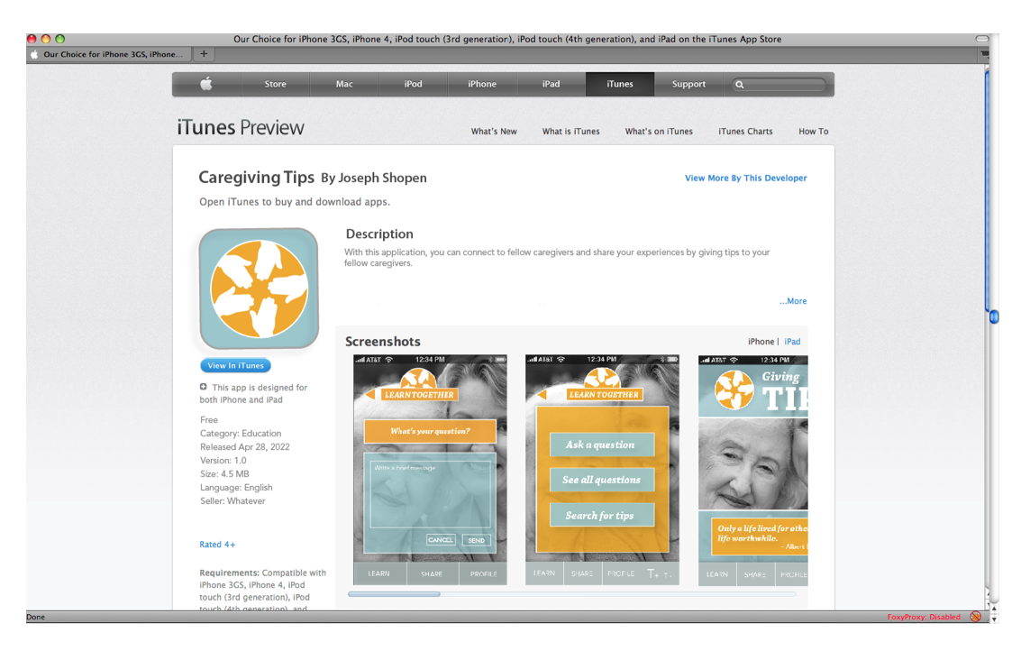
I'm going with this idea, but making it warmer like the other option that you see below. and i am going to use the circle logo rather that the square. and i have to decide on a title still...


Monday, April 18, 2011

Sunday, April 17, 2011

app reading & my app

5 points:

. It is best to use the built in gestures rather than to make your own. In the interest of not confusing the user.

.Using customized gestures can be helpful for some applications like games. but not for practical applications where users need to
understand things clearly.

.gestures should be simple. it is easy for an app to get two gestures confused with one another if they are too similar. also users should be getting feedback for when they have successfully made a gesture.

.icons should visualize a simple concept or object and be visually cohesive and consistent.

.use the icons that apple has already designed whenever you have the opportunity to do so. users can interpret these icons very quickly as they are already accustomed to them. If you don't conform to apple's regulations then your app may be rejected.


____
MY APP:

The subculture that I am designing for is familial baby-boomer caregivers.

An issue that some caregivers may have is not knowing the best way to do a certain task.

The app that I will be designing is an app whereby caregivers can communicate by sharing experiences and by giving tips with one another on how to achieve any task that might prove difficult.

Friday, April 15, 2011

APP find and share

1. find cool app:
.http://www.youtube.com/watch?v=h2OfQdYrHRs&feature=player_embedded
.http://www.androidtapp.com/talk-to-me/ - verbal translation
.redlaser: http://www.stringcaninteractive.com/blog/free-cool-apps-for-android-and-iphone/

2. get subculture & research

3. concepts:

.magnifying for small type.

.a resource where people

.iphone app for promoting healthy lifestyle.

.entertainment app

.easy cooking app!

.iphone app for nutrition (http://www.little-black-dress-fitness-tips.com/iphone-apps.html)

.social app for babyboomer (between caregivers or between caregivers and their friends)

.ways to save money on ...

">http://www.youtube.com/watch?v=h2OfQdYrHRs&feature=player_embedded


1. find cool app:
.http://www.youtube.com/watch?v=h2OfQdYrHRs&feature=player_embedded
.http://www.androidtapp.com/talk-to-me/ - verbal translation
.redlaser: http://www.stringcaninteractive.com/blog/free-cool-apps-for-android-and-iphone/

2. get subculture & research

3. concepts:

.magnifying for small type.

.a resource where people

.iphone app for promoting healthy lifestyle.

.entertainment app

.easy cooking app!

.iphone app for nutrition (http://www.little-black-dress-fitness-tips.com/iphone-apps.html)

.social app for babyboomer (between caregivers or between caregivers and their friends)

.ways to save money on ...

Monday, March 14, 2011

flash website process 2

I played much with the backgrounds and with the top navigation bar of the web page. these are various iterations before the final version.
I spent about 8 hours too many to find a way to take the pictures in the way that I needed. Alas, to no avail.
I ended up using the old photo that you see in this image for my background. which is actually very fitting. as it is a mid century photo of union station.


Sunday, March 6, 2011

RENDERING


----
----


-----
-----


-----
-----


-----
-----
OTHER


Friday, February 25, 2011

hi.

http://www.scribd.com/full/49558617?access_key=key-1l6ehjbyc563vzbwexki

Friday, February 4, 2011

reading 2 response

Don't make me think: CHP. VI:

As always, it is important that the designer of a website think about the big picture before thinking of too much detail. Don't think about the bells and whistles before you setup up the overall interface. and it is important to not assume that the user will understand the interface without making enough indications as to what they should do.

Despite the fact that we have the options to use any typeface — the issue of legibility still stands. Some typefaces were not made to be on the web at all and have low contrast.

Body texts are usually the best option when designing for the web. It is easier to read in greater amounts of text, and at a smaller side. It is possible to customize your type by changing the x-hight a little or bumping up the contrast.


_____
_____
Web Design is 95% Typography (link):

There are some issues concerning design on the web: one is that there weren't enough typefaces to choose from, and another is that there is low resolution on the web which makes readability difficult. But these issues are not as concerning as making sure that the interface of a website is not cluttered with too much information which cannot be easily comprehended. USEABILITY should be stressed and addressed before people are concerned about the afore mentioned issues. It is the job of an information designer to be sure that information is ordered in such a way so that the user is able to digest the information and not be overwhelmed.

There should be standards or certain conventions that everyone should follow — but by no means should everything look the same. Just as long as a website is functional with various technologies, and is flexible in some way.

In the interest of keeping a space well organized, the designer should think about:

You should consider the following: proper text size, whitespace, linespacing, alignment/grid, consistency with size, strategically place images that don't interrupt, good text/background contrast, visible links (visited or not), navigation tools should be well marked out.

Monday, January 31, 2011

NEW YORK TIMES:speculation


Needless to say, the New York Times newspaper is messy. There is no hierarchy. the search bar at the top of the web page changes when you go from section to section, and the articles are sporadic. It seems to me that much of the information could very well be consolidated so as to make it much easier to navigate through the website. The way it is now, if you wanted to find or re-find a particular, it will be much more difficult than it needs to be. However NYT does make use of the search bar which is handy if you know what you are looking for.


It is helpful that sometimes the different option bars (for choosing major topics) are in more places than one, but they take different forms in different places. consistency is the key.
They try to show too much information at the same time — however many lines they make to section things off, it's still a lot of information that is see all at once. Things can be more compartmentalized. however it is important to keep minimal links (clicks) and it is most helpful to use certain conventions such as scroll boxes within the windows.
dont make me thing: chp. VI
the 95% and follow up.

DONT MAKE ME THINK:reading

CHAPTERS III, IV:

It is always important to not loose the interest of the reader. You should use the space that you have in a thoughtful way in order for the reader to ease their way through their user experience.
You do this through making an easy-to-see visual hierarchy. (make more important things bigger or with color, use a good amount of whitespace, avoid distracting noise of any kind, and keep things consistent so that a thread of related information can easily be followed).

Convention:
There are particular tools that can be utilized in order for users to view information more practically. A convention is generally something that a user has had experience with or can figure it out pretty easily. There's always a better or different way of doing something — according to everyone who does things their own way. But a convention should not be subject to individual interpretation. and it is always important to remember that a new convention can very well be developed.

A person easily looses interest if there is too much stuff to look at. they need to have clear options that can easily be acknowledged, yet ignored — but can still be remembered and referable. And, clearly mark buttons which function with no extra surprises again to ease the user experience.


Consistency is the key for making sure that the user is able to remember where he/she is and know where they are.


Thursday, January 27, 2011

Reading response

WURMAN:

Traditionally, we have been educated to focus on the things that we are told important. We have to follow an artificial path which leeds people away from their true creative potential. I thought that was an interesting thing to note. Wurman questions

Wurman talked about the flood of information which grows and grows with every new decade. It has become necessary in some way to organize this information. but how. and who should organize it? ~ Information is how we understand and refer to any topic whether it be data about government, history, economics, etc. "Information is everything. We are what we read." (Wurman).

The designer should be a part of the process when information is put forth from one set of people to another. It use to be the case (fortunately now things have changed) that the designer just made things pretty. But now the designer is much more involved with the whole process of development. The designer should not only choose the typeface, he should be structure things so that they are user friendly. no one wants to read a thousand words if they can just as easilly get the same information if it were to be organized in the right way. Theoretically, a designer is the one who best knows how to do this.

Information is organized by:
  • Location
  • Alphabet
  • Time
  • Category
  • Hierarchy

analyzing NYT interface

The following is a visual comparison of the New York Times newspaper interface and the NYT webpage interface. In my group we noted the benefits of the online version: you can use the word search feature, rich media, motion, rich media (motion, gifs, podcasts, etc), user ratings, more information that is easily accessible, share articles with friends, and easily find old articles.


Front page of NEW YORK TIMES: ARTS (news print)

Home page of NYT:ARTS (web page)
Average # of articles was 19

Article page of NYT:ARTS (news print)

Article page NYT:ARTS (web page)
Average # of articles was 1