text_channel from joseph shopen on Vimeo.

Wednesday, September 22, 2010

Monday, September 20, 2010

Sunday, September 19, 2010
READING RESPONSE
UNDERSTANDING COMICS (CHP 3)
The chapter begins by talking about a philosophical issue – that is, do things that we don't sense exist... when the tree fell on the ground with no one there to hear it, did it make a sound. That issue.
As artists, we inherently use the technique of CLOSURE to communicate particular things. Closure simply relies on the viewer to piece things together, or to complete an image or idea. By utilizing these inherent skills of the human brain, the artist/communicator has a more simplified task – and is relatively free to a certain amount of fragmentation and rendering styles and things...
It is not possible to draw the planet AND everything on/in it all in one picture frame. [unless it was a really big frame that was temporally sensitive (using motion)...] It's hard enough to communicate one human action in one frame. It is easier to do with time based media than it is with comic strips because one has only so much space to work with when rendering a comic – so the images and messages are very fragmented. for comics there are different levels of fragmentation. they can be as simple as say two stills of a stop-frame animation, or the can be as complex as going from one scene to another (ie two characters are at a gas station in one frame, and in the next the are on the beach).
The author who uses CLOSURE (I wonder why the used that word to name the concept) is able to make it more easy or difficult for the viewer to follow what he is communicating.
Saturday, September 18, 2010
PROCESS
started by studying the poems that I selected. I was looking for good line breaks and seeking out interesting words that could be played with or that could be emphasized.

I printed out (book) typefaces and thought of ones that were interesting. I decided that a simple serif would be good. I chose ADOBE GARAMOND PRO, and GRANJON.

Then I went on to explore some compositions that might be interesting. 


But there was no concept or anything to make these work. They were just words floating around on the page.




***********
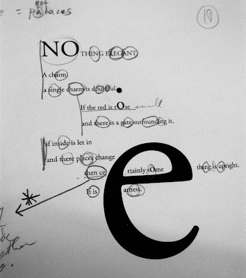
Then I thought I found a good route that might take me somewhere? I had a concept, as simple as it was. I liked the contrast of certain characters to others when the were made big. The black to grey to white was interesting. well, a bit interesting. And that was it pretty much. I continued to use my line breaks, and sometimes would separated phrases that I thought to be particularly interesting:


but NO. they "Really sucked". And indeed they did. It was a good challenge to finally come up with something better. *But I feel that if I hadn't gone through with what I had, I would not have ended up getting what I did.* That's especially important.
Instead, the compositions and concept evolved into something much more interesting
***********
So then I thought of this:
and it was good. and VERY fun to do. I looked forward to working on this every time I thought about doing it. prior to doing it...
The idea is in my colophon:
Gertrude Stein played with words. She played with the meaning of phrases.
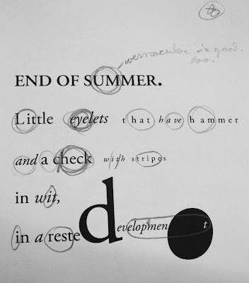
These compositions endeavor to playfully explore words and their meanings, as well as new words within words that carry different meanings:
Iterations: book mockups: corrections. This was an important part for refining the final product. I proceeded to make adjustments in illustrator.


So I went through and circled each word (as you can see in the previous set of compositions) and emphasized them by making them Italic or bold or upper case, etc. In doing that, It allowed me to come up with an interesting and uncontrived (and unpredictable) layout. and that was nice. that solved my problem of finding an interesting composition. Then I decided to justify and center the compositions. That made quite structured and helped to balance of black and white – and so the result was a rather sophisticated (I flatter myself) and interesting, yet unpredictable layout. Each one being different then the other.
************
final product:


index:


PROCESS
.Exploring Typography. I started by working with my hands by cutting and pasting.


. Just to get into a certain mode of thinking. Then I jumped into illustrator and threw the type around. These are the final results:

With this compostition, I went for very narrow columns and was not only playing with the narrow forms, but also looking at the negative space. With the forms that overlap, I was playing with the density of different letterforms.


Here, you can read most of the paragraph from the outside to the inside. I wanted to explore rotation and to find an interesting way to play with how the viewer might interact with the composition. I was playing with contrast here as well.
With both of the following compositions I separated each word in the paragraph and then selected every other word, changed the typeface a little bit and then rotated them. With the composition on the top, you end up with a very nice, simple and sophisticated lay out which can be rotated. The letters are essentially decontextualized but still in fairly close proximity so, with some study, you can still make some sense out of them.


Cl:~)
Wednesday, September 15, 2010
NA PRO. 3 DETAIL NARRATIVE
Channel: Moving image.
Concept: showing toys that teach inherent, fundamental skills to children and relating to the real world.
The objectives that I used were (1) objects associated with the topic (2) using the visual language.
For the sake of clarity and simplicity, it is important to think through the narrative.
.What I learned by exclusively using one particular communication channel:
The channel I chose was moving image. The real challenge of the project was using only one channel. There were times when I would catch myself trying to clarify the message of the narrative by using text. When I couldn't do that, I had to find new and different ways of clarifying things by simply using the imagery. That's where I had to rack my brains and think through thoroughly about how my narrative was constructed and how I could fine tune it even more so that the concept would be more relevant.
.How I constructed the story by utilizing what I know about narrative, and what did I learned from that process:
The narrative was intended to be constructed with a simple and precise story line. Being forced to use only one channel dictated how I was to construct the narrative. I learned to be more concise with the message, and to use simple imagery and and movement that could only be seen in a certain way – thus avoiding confusion by including other possible connotations. That was the intention.
Monday, September 13, 2010

Subscribe to:
Posts (Atom)