started by studying the poems that I selected. I was looking for good line breaks and seeking out interesting words that could be played with or that could be emphasized.
I printed out (book) typefaces and thought of ones that were interesting. I decided that a simple serif would be good. I chose ADOBE GARAMOND PRO, and GRANJON.


But there was no concept or anything to make these work. They were just words floating around on the page.
***********
Then I thought I found a good route that might take me somewhere? I had a concept, as simple as it was. I liked the contrast of certain characters to others when the were made big. The black to grey to white was interesting. well, a bit interesting. And that was it pretty much. I continued to use my line breaks, and sometimes would separated phrases that I thought to be particularly interesting:
but NO. they "Really sucked". And indeed they did. It was a good challenge to finally come up with something better. *But I feel that if I hadn't gone through with what I had, I would not have ended up getting what I did.* That's especially important.
Instead, the compositions and concept evolved into something much more interesting
***********
So then I thought of this:
and it was good. and VERY fun to do. I looked forward to working on this every time I thought about doing it. prior to doing it...
The idea is in my colophon:
Gertrude Stein played with words. She played with the meaning of phrases.
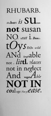
These compositions endeavor to playfully explore words and their meanings, as well as new words within words that carry different meanings:
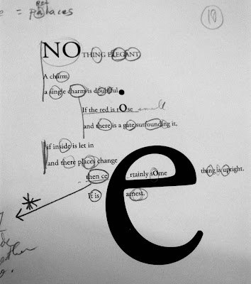
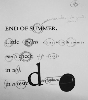
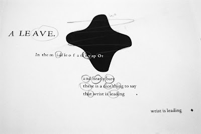
Iterations: book mockups: corrections. This was an important part for refining the final product. I proceeded to make adjustments in illustrator.
So I went through and circled each word (as you can see in the previous set of compositions) and emphasized them by making them Italic or bold or upper case, etc. In doing that, It allowed me to come up with an interesting and uncontrived (and unpredictable) layout. and that was nice. that solved my problem of finding an interesting composition. Then I decided to justify and center the compositions. That made quite structured and helped to balance of black and white – and so the result was a rather sophisticated (I flatter myself) and interesting, yet unpredictable layout. Each one being different then the other.
************
final product:
index:


No comments:
Post a Comment