
Monday, December 6, 2010
Sunday, December 5, 2010
poverty design problem: final process


_______
_______
We then had the idea of taking the scenario of MO who was ripped off by not getting a reciept at the mortgage place during the poverty simulation.
So we thought we might make a poster where we would tell out target audience (low income people) how they might be screwed - and show them ways to avoid that.


using a different tagline, we tried different messages with different imagery. this message was pointing out that some people can get robbed.... and these things affect family etc. we didn't go this direction.

______
We then got ahold of our new idea, and developed it from here:


___
THESE OUR OUR 3 messages that we ended up going with:


_____
_____

We continued to refine our color pallete, add imagery to the compositions, and refine the messages.


___
___

We ended up splitting these three messages into 3 different channels.
the first (yellow) is a poster that can be strategically placed at a location that might rip you off, and the next is a poster and plackard that are located on the bus and at the bus stop, and the third is a motion piece that can be seen on screen on television which ideally would be located in a waiting room of where our target audience would be.
This is our final in context shot of our bus plackard:


PROCESS BLOG
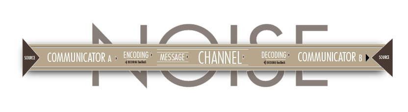
Vi and I started the project with our schematics that genearally followed the model of our own schematics. This model addresses more specifically some issues that were expereinced in the Poverty Simulation that was held in Eperson Auditorium. Here are different iterations as we


Then we ended up with our final iteration and included that into our presentation:\

and here's a detail. for the prestentation, we strategically zoomed in to talk about the specific things that we needed to.

all about PROJECT 8
Still frames of my schematic:


I definitely learned a good deal from this project. For one, I had never made a non-linear narrative where I could let the user really interact with the message. In doing a non-linear narrative, where the viewer can control the pace of this design artifact rather than simply sit and watch without pushing any buttons, I believe that my message is clarified. Before, when it was just a print, I could only say so much. All the information was generic and if a person wanted more information, it wasn't there. But in my user oriented schematic that I built on flash, I was able to add that extra information. When each word on the schematic is rolled over with the moused, a definition pops up.
The viewer tends to read the schematic from left to right because it is structured linearly. So each word and definition is read chronologically — however the viewer does have the option to look at any word or play the animation at any given time. The animation is played when the viewer clicks on the SOUCRE A button. The arrow moves from left to right thus demonstrating the linear, chronological importance of the schematic.
I was glad to get my feet wet with Flash .3 scripting. That demo that garret gave was most helpful. Now I won't be nearly as intimidated to get into that in the future as I would have been without learning those basic functions.
Tuesday, November 23, 2010
Reading response
I DO DECLARE: (link)
This was definitely helpful I'd say.
I'ts important to be able to make good presentations. One would expect that designers would be good at that, but apparently they aren't for the most part. 'Designers should arouse the audience, not merely incite'.
The different guidlines are helfpul in making the experience more engaging for the audience:
.showing a 'map' of what you're going to talk about – a thesis statement.
.utilize your strengths - play down your weaknesses. (i.e. if you don't talk much, use visuals).
.keep the audience guessing.
.incorperate different ways of speaking.
.edit. use critical insight.
.use humor when possible and appropriate.
.don't let the audience be stuck in the same thought for too long.
.speak rather than read. or if you read, don't let it be evident. - let the audience read aswell. That is another way to engage.
.make it obvious when the end is going to be.
__________
BE SELFISH (link)
It is inspiring to think that a presentation can be a learning experience not only for the audience but also the presenter. If you set it up in such a way, changing your approach to however you came up with what you are presenting, new things might easily occur to you.
For any presentation, it would be best to know your audience as much as possible. know what they know and don't know. you don't want to touch on things that they already know, and you don't want to ovewhelm them with things that they don't know. Know if there is anything that they might be able to talk to you about.
Use heirarchy. don't give the audience something to read and expect them to listen to you talk at the same time. Use imagery to correspond to what they say instead.
Use basic design principles to make presentations visually engaging — easy to read typography, etc.
use a simple structure that your audience can easily follow and so give you feedback. After you acquire feedback, take good note of it so that you will be able to reflect upon it and use it to inform any further progress.
before you present, practice of course, and loosen up. get excited.
____
TED talk:
The presenter of this presentation about Green School said what he had to say with simple language. He was not over articulate. he used short and concise sentences. He was able tell the audience, in simple terms, what Green School was all about. The images that he used supported everything that he said very well. Over all his message was very clear and easy to follow. He did not engage the audience any longer than necessary. everything that he had to say he said in a reasonable amount of time. His presentation was simple and in no way pretentious or overly thought out. it seemed honest and thorough. it was super.
Reading response
I DO DECLARE: (link)
This was definitely helpful I'd say.
I'ts important to be able to make good presentations. One would expect that designers would be good at that, but apparently they aren't for the most part. 'Designers should arouse the audience, not merely incite'.
The different guidlines are helfpul in making the experience more engaging for the audience:
.showing a 'map' of what you're going to talk about – a thesis statement.
.utilize your strengths - play down your weaknesses. (i.e. if you don't talk much, use visuals).
.keep the audience guessing.
.incorperate different ways of speaking.
.edit. use critical insight.
.use humor when possible and appropriate.
.don't let the audience be stuck in the same thought for too long.
.speak rather than read. or if you read, don't let it be evident. - let the audience read aswell. That is another way to engage.
.make it obvious when the end is going to be.
__________
BE SELFISH (link)
In Response to the Readings
.Sketches and Prototypes: (link)
The reading makes abundantly clear that a sketch is something different than a prototype. A sketch is something that is freehanded and whimsical and does not require any commitment. A prototype is similar in a way, though quite different. A prototype is further along in the development of the creative process. With a prototype, you are still free to explore, yet at that point in the process, you will have (after making sketches) made some commitments toward certain ideas.
You use a sketch to think of a loose idea – it is something that is affordable in both time and materials. The prototype is an affordable way of demonstrating how a project will finally turn out – it should allow you the freedom for some minor change, but mostly just refinements.
________
Monday, November 22, 2010


Tuesday, November 16, 2010


Sunday, November 14, 2010
process: IDEAS
final artifact: (for some reason, the sounds didn't upload to YOUTUBE)...
I was still having issues exporting and .mov file from flash. I attempted a number of solutions after doing a considerable amount of research on the matter, but to no avail. I found that even profesionals had issued complaints to adobe saying that this has been an issue with flash. and surprisingly enough, adobe still charges up the wallloo for their product. But I did what I could, and for the most part the motion piece is as you see it. but minus the bits left behind.
and here's my logo build
My understanding of the theory of story structure was richer because I was able to use more channels than one. by using different channels simultaneously, I message can be conveyed a great deal more effectively than simply using one channel. However, I realized pretty quickly that in adding more channels than necessary, a message's meaning can easily be distracting or altered unnecessarily.
I thought that by simply using only two channels (image and sound effects) that my message was quite clear, and quite effective. It seems quite capable of holding the audience's attention for the whole of its duration. and I think it is quite memorable, and the message is clear: that is, YOT makes toys which are creative, innovative, and inspire imagination.
I found it to be quite a challenge to compose these visual elements in a fairly beleivable way, which would still seem playful and yet somewhat realistic. another challenge was to add sound that was approriote. so there was a considerable amount of compilation of sounds (I used audacity for that). I had to time them, layer them, and cut them, then reimport the audio files into flash. it was a bit of a process, but one that I am comfortable doing by now.
I had many versions of how the toy blocks move. I tried making them swing like on a crane and that was tough. I also tried to create a 3D cube for those toy cubes so that I could have the block spin as it moved. that didn't work very well. Id probably want to use After Effects for that. duh. I found it helpful to look up real videos of these actual mechanism from the real world. I used that to inform the way I put my objects into motion. At least you can understand what each object is doing. that's nice.
I'm glad the transitions are fairly seemless too. I'm proud of the carrots swinging in toward the end.
process: IDEAS
final artifact:
I was still having issues exporting and .mov file from flash. I attempted a number of solutions after doing a considerable amount of research on the matter, but to no avail. I found that even profesionals had issued complaints to adobe saying that this has been an issue with flash. and surprisingly enough, adobe still charges up the wallloo for their product. But I did what I could, and for the most part the motion piece is as you see it. but minus the bits left behind.
and here is a fairly close attempt at fixing the matter by importing an flv to after effects and exporting that to an .mov. however the sound got lost in that process somehow.
Sunday, November 7, 2010
more koenig process
Thumbails for layouts. helped a lot. but i was having trouble puting them in the digital format.


_____
Here is a set of layout that were put on a simple grid. as BORING as they look, doing this helped me get a better appreciation of the grid, and a better understanding of how to set up a digital layout that is not super wacky.


_____


Thursday, November 4, 2010


Subscribe to:
Posts (Atom)