1.
Reflecting on the very first project that we did (the dot project) I can see we used abstract images to communicate, not representational or symbolic. Throughout the semester we have only really used abstract images.
It is always important to keep in mind that visual abstraction is the simplification of a more complicated and deep meaning.
________________
SIMILARITIES IN PROJECTS ONE AND THREE:
We used visual abstraction to communicate certain concepts in the dot project, and also later in the book of taxonomy and the haiku.
Also in Project 3 I did at times keep in mind the 12 core priciples of design: These were used periodically in the taxonomy and the animation - with the compositions of the analogue marks and the digital compositions of the flash haiku:
1. allignment
2. framing
3. symmetry
4. asymmetry
5. scale
6. continuation
7. proximity
8. positive/negative
9. compound shape
10. repetition
11. correspondence
12. layers
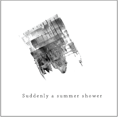
Just as we looked at using transparency and including text with our compositions in the dot project, we also introduced type into the flash project, and had to consider how it fit into the composition.
Throughout the semester I made a point of using mind mapping as much as I could in order to help me think of plenty of ideas, and not get stuck with just one thought. We also made thumbnails scetches with iterations which helped us through the creative process.
__________________
SIMILARITIES BETWEEN PROJECT ONE AND PROJECT THREE:
With Project 2, we began making lots of abstract line compositions and manipulated them by hand with UNTRADITIONAL TOOLS - thus getting unexpected but interesting results. This is what helped to make the final result visually appealing and not so artificial.
Throughout the semester (especially in project 2 and 3) I continued to practice effective and practical file management.
Just as we focused on a cohesive theme with our accordion book of juxtaposing spreads, we had to find a way to make a book of taxonomy that clearly communicated our connotative and denotative meanings.
In project 2 we learned how to digitalize our images using both photoshop and illustrator. Throughout both projects I was able to learn and fortify my skills of the digitalizing and vectoring process.
_____
In addition to strengthening my understanding of the principles that were learned in the previous projects, I also was introduced to a few new principles of design.. and stuff:
In the third project I was able to strengthen my understanding of how language and form can be intermingled, and how to construct something that has a visual and conceptual to something that already exists (haiku animation).
Also, in the midst of the process, I learned what an ICONIC shape was (a simple form that has cultural connotations) and also abstract shapes (what we have been using throughout the semester).
With the taxonomy project I learned about connotative and denotative meaning. These concepts had to be clearly presented in the book of taxonomy. (the denotation in the book was represented by the tools that I used to make the marks which then became shapes that had apparent connotations).
There was a particular process that was developed when making all of the analogue shapes and when creating the thumbnail iterations:
Process: Selection (chose the marks) > iteration (made different shapes with the marks that were similar) > validation (selected the most successful shapes and then repeat until you find the best result.
Also, there were that were learned for the flash animation:
The five basic transitions:
1. Transparency
2. Zoom
3. Pan
4. Wipe
5. Morph
It is usually best to use many of these transitions simultaneously as that helps to trick the eye, and helps to make the motion more complex, believable, and sometimes more realistic.
____
ALLLLLL of these things that were learned this semester will be extremely useful to know in the next semester. Knowing all of the principles of design is what make a successful designer.
____
2.
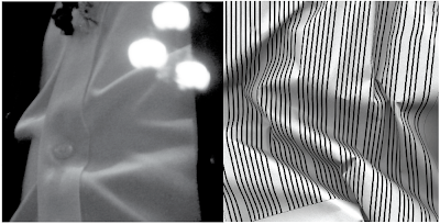
This is a spread that juxtaposes one of the manipulated line studies (progression) and a photograph that was selected from my archive of photos. This particular photo was selected because of its visual similarities to the line study.
I find this particular juxtaposition to be interesting. It is especially appealing in a visual sense because of the complexity of the lines and the smoothness of the curves.
Despite this, it was left out from the final layout of spreads because it was not quite as succesfull as it could be. First of all, in the photograph, it was not clear what the image actually was. In the rest of my images in the 'line book' were clearly located somewhere in the city. It was also clear that this particular image did not quite fit in with the narrative that I was trying to express in the book.
So, because of this, I made a decision to not include it in the final book, however fond of it I was. Looking at it now, I am glad that I stood by my decision to not include it into the final book.


Glad to hear that you continued mind mapping. It is important that you post that kind of process to your blog so I can see that you are engaging those techniques.
ReplyDeleteActually the definition of "cultural connotations" that you listed for Iconic is for Symbols.
That juxtaposition is visually interesting. It had some faults due to legibility and focus, but more importantly, (and as you pointed out) it was a good call to edit it due to narrative and cohesive purposes.