Thursday, December 17, 2009

just things


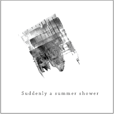
Initial sketch/drawing of idea.


Digital translation:


Wednesday, December 9, 2009

Paul Rand

Paul Rand is a very famous graphic designer. His work has been influential in the design field. He's well known for doing corporate logo designs.

In the video there are good examples of pan, zoom, and wipe. There seems to be a rather extensive use of pan. and the morphing of the characters were interesting.


Paul Rand has a knack for saying things in a very precise and clear way. Whatever he says makes a good deal of sense and is jam packed with meaning.

"A WORK OF ART IS REALIZED WHEN FORM AND CONTENT COME TOGETHER."

"...WITHOUT THE AESTHETIC MEANS THAT IS DONE WITHOUT SOME ALTERIAL MOTIVE - BECAUSE OF LOVE, BECAUSE IT SELLS..."

evolution and documentation of tools


Documentation of tools:


Documentation of Taxonomy

My final product for my book of taxonomy ended up being quite different than how I had first thought of it, however it was fundamentally the same thing.

My initial proposition was this:

As the process of creating the book developed, I had made some changes with the size of the book. Initially I had proposed the 8.5 x 11 - which is the size of the paper that the original marks were on. This lead to problems with me being stuck to this format - and it made me subject to already set compositions that were not visually appealing. So then I sized it down to 5.25 x 6.25 and selected part of the pages that I thought were interesting.

I then broke up my marks into three sections which were identified denotatively (with the tool that made the marks). then on each page there was a label that pointed out the different connotations that some of the marks made. I made a point of not marking all of the analogue shapes because I wanted the viewer to be able to be more involved in imaging for them selves what some of the marks would be.

Then I made the decision to put a backing on each page to make the whole book more refined. the first paper that I tried did not work because it was too white and had a lot of texture which made it distracting. So then I hand-died more paper and applied that to each page.

The cover I made metal. The same material that is on the back of each page is on the front and back cover. Metal seemed to me to be the easiest material to manipulate. It is also sturdy.


Tuesday, December 8, 2009

FINAL REFLECTION


1.

This project had two parts: The book of taxonomy of marks, and the haiku. Both of these projects had some aspect that was closely related to one of the two projects that we did previously. We have been using some of the same principles of design in every project.

Reflecting on the very first project that we did (the dot project) I can see we used abstract images to communicate, not representational or symbolic. Throughout the semester we have only really used abstract images.

It is always important to keep in mind that visual abstraction is the simplification of a more complicated and deep meaning.


________________
SIMILARITIES IN PROJECTS ONE AND THREE:

We used visual abstraction to communicate certain concepts in the dot project, and also later in the book of taxonomy and the haiku.

Also in Project 3 I did at times keep in mind the 12 core priciples of design: These were used periodically in the taxonomy and the animation - with the compositions of the analogue marks and the digital compositions of the flash haiku:

1. allignment
2. framing
3. symmetry
4. asymmetry
5. scale
6. continuation
7. proximity
8. positive/negative
9. compound shape
10. repetition
11. correspondence
12. layers

Just as we looked at using transparency and including text with our compositions in the dot project, we also introduced type into the flash project, and had to consider how it fit into the composition.


Throughout the semester I made a point of using mind mapping as much as I could in order to help me think of plenty of ideas, and not get stuck with just one thought. We also made thumbnails scetches with iterations which helped us through the creative process.


__________________
SIMILARITIES BETWEEN PROJECT ONE AND PROJECT THREE:

With Project 2, we began making lots of abstract line compositions and manipulated them by hand with UNTRADITIONAL TOOLS - thus getting unexpected but interesting results. This is what helped to make the final result visually appealing and not so artificial.

Throughout the semester (especially in project 2 and 3) I continued to practice effective and practical file management.

Just as we focused on a cohesive theme with our accordion book of juxtaposing spreads, we had to find a way to make a book of taxonomy that clearly communicated our connotative and denotative meanings.

In project 2 we learned how to digitalize our images using both photoshop and illustrator. Throughout both projects I was able to learn and fortify my skills of the digitalizing and vectoring process.


_____
In addition to strengthening my understanding of the principles that were learned in the previous projects, I also was introduced to a few new principles of design.. and stuff:

In the third project I was able to strengthen my understanding of how language and form can be intermingled, and how to construct something that has a visual and conceptual to something that already exists (haiku animation).

Also, in the midst of the process, I learned what an ICONIC shape was (a simple form that has cultural connotations) and also abstract shapes (what we have been using throughout the semester).

With the taxonomy project I learned about connotative and denotative meaning. These concepts had to be clearly presented in the book of taxonomy. (the denotation in the book was represented by the tools that I used to make the marks which then became shapes that had apparent connotations).

There was a particular process that was developed when making all of the analogue shapes and when creating the thumbnail iterations:

Process: Selection (chose the marks) > iteration (made different shapes with the marks that were similar) > validation (selected the most successful shapes and then repeat until you find the best result.

Also, there were that were learned for the flash animation:
The five basic transitions:

1. Transparency
2. Zoom
3. Pan
4. Wipe
5. Morph

It is usually best to use many of these transitions simultaneously as that helps to trick the eye, and helps to make the motion more complex, believable, and sometimes more realistic.


____
ALLLLLL of these things that were learned this semester will be extremely useful to know in the next semester. Knowing all of the principles of design is what make a successful designer.


____
2.


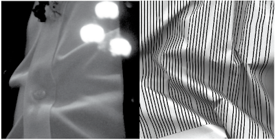
This is a spread that juxtaposes one of the manipulated line studies (progression) and a photograph that was selected from my archive of photos. This particular photo was selected because of its visual similarities to the line study.

I find this particular juxtaposition to be interesting. It is especially appealing in a visual sense because of the complexity of the lines and the smoothness of the curves.
Despite this, it was left out from the final layout of spreads because it was not quite as succesfull as it could be. First of all, in the photograph, it was not clear what the image actually was. In the rest of my images in the 'line book' were clearly located somewhere in the city. It was also clear that this particular image did not quite fit in with the narrative that I was trying to express in the book.

So, because of this, I made a decision to not include it in the final book, however fond of it I was. Looking at it now, I am glad that I stood by my decision to not include it into the final book.

Sunday, December 6, 2009

cdf ec

mc sweeney presentation
digital kitchen

Monday, November 30, 2009

VIS COM find and share

This short video has all of the elements of an animation:

Transparency (54.00)
Zoom (beginning)
Pan
Wipe
Morph

Also an integration of text. (and a little logo design in the end).


_______________________________

With our animation we began by making marks with our hands.
Tthe following animation is done real time by hand (with sand) – so the animator has to be very creative with the transitions. (some transitions at 1.45, 3.30, 4.35, 6.10)-

This animation also demonstrates the fact that sound is a very important element.


_______________________________


interesting.

4.30 is interesting part... in a vague sort of boring way.. possibly..

http://www.youtube.com/watch?v=u3jHYmonhag


CDF - Warhol Exhibition - E.C.

Terri, don't read this yet. not quite done.


On two occasions, I took the opportunity to see the Warhol exhibition that is showing at the Union Station in Kansas City, Missouri. The exhibition proved to be quite informative, and an appropriate thing to see as I was in the midst of studying color and am also always interested in the process of printmaking.

Within the exhibition

color related stuff:

diamond dust and strling color variations. parts of this tecnique. he extensively used optical mixing in his prints. (i.e. the marylin prints). warhol also used many color combinations that are dramatic and typically unnatural, which makes them stand out considerably. However the great majority of this series are visually appealing.


It is apparent that the color palletts for his commercial work were very simole and stragiht forward. Look at his series of cambel's soup cans. For these he only used mostly red, yellow, and black. I noticed that in this particular series, there was no change in chroma or in value – only a change in hue.


with his flower prints, he used transparency., this makes for a perfect study of color transparency. the second one on the wall at the exhibition, you see blue over orange which makes a purple...


this color mixing and overlapping makes the images busy. However, since the colors are related, it makes the image easier to look at – more pleasing to the eye. The colors are related in the since that one might have the same intesnsity in all its hues, but another might have contrasting chroma withc makes some parts pop out. In one particular painting, Warhol actually did use a proper opposite color scheme.


Sunday, November 29, 2009

CDF update

I've been browsing around this blog that I found. This blogger definitely likes color and talks about the many different and practical applications of color. color in art, product design, graphic design, fashion, interior design, sculpture, architecture...

It is important for me to constantly remind myself just how important and exciting that color is and how useful it is. It's great to think of how color effects absolutely everything that you make. that's why its usually better to make things – whatever it is – without color so as not to be distracted by it. (just a thought)

In this blog, there are many remarks that simply make you think – many intelligent observations. The person has drawn a number of very interesting images from various sources.


here is the link:


Sunday, November 22, 2009

CDF update

Illustrator has proved a very useful tool. Lately I have been able to use it without much hinderance of a lack of experience with the program. The more one uses a complicated tool like that, the more confident and efficient one becomes. Trial and error is a good way of learning things - that and practice practice practice. Photoshop is also a very useful tool. In a matter of minutes, I was able to produce something (however simple it is) that I had in mind to create. Within a very short amount of time, I was able to realize an idea - that is something that is not always easy to do.


I have to say, it's amazing to see the difference between pantone color, and how it produces when it is configured to CMYK. of course, printers are only capable of so much, which means that they are not as effective when producing color as we would like.


Wednesday, November 18, 2009

VIS COM text fram A, B, C


r.e.m.b.e.r

A valuable lesson often slaps you in the face, and then you say, "AHAA – I see it now".

It's important to remember that, whatever you present (however simple or complex it is), your idea should be able to stand on its own and communicate itself without you helping it along...

Tuesday, November 17, 2009

CDF

its interesting to see discussions about anything (architecture, sculpture, history, etc.) and think to yourself what those things have to do with design, and what design has to do with them.

Monday, November 16, 2009

TAXONOMY UPDATE

_____________________________________________________
UPDATE: (refer to taxonomy proposal in blog post below)

–Concerning the format:
- the pages will be organized connotatively, according to what kind of mark that they made.
- Each page will be labeled denotatively.
-periodically, there will be a page on which a single mark will be blown up and printed in color (as all the marks in the book are actually blue) and there will be specific and more elaborate information concerning that particular mark.


Samples of labels: (note: Labels will be on bottom right hand corner of every page denoting the tool with which the marks on that page were made).


-There may be a periodical page with a photo of the instrament that made the mark. It would look remotely like so:


–The cover:
-metal? - easy peasy: nice and sturdy, can be manipulated in appropriate manner.
-something thik.


–Glossary


_OVER ALL:

–In order for the book to look refined and visually cohesive overall, I intend to treat every page in the same way. I have a couple ideas for that:
-The back side of each page will have a thicker piece of paper mounted onto it.

-I have considered putting a faint pattern of lines on each page which represents a visual and conceptual relation between every page.

-Between each page, there may be a piece of vellum that would act as visual separation (this will slow the pace of how the book reads)

- I have considered putting a thin layer of gloss/semi gloss spray on each page so that it gives them more weight, and protects the hand made marks.


COlOR DRAWING FORM update nov. 9-13

These are complimentary colors. A study of color in the environment.

In taking pictures of the flat maps for my color photos in the environment I realized that I am lacking a considerable amount of skill as a photographer. and that's no fun.
However, through trial and error, I have managed to come up with some interesting compositions that are mostly in focus. (it didn't really help that I was using several different cameras every time I would take photos).

TYPOGRAPHY I


Sunday, November 15, 2009

bernini is inspiring.


.........

.........

sleep

slope

snow

and ice

shh.

sleep

with

hope

dreams

be nice.

........

........


Everything has to do with design - a designer should be aware not only of the 2 dimensional realm, but also the realm of the third dimension.

CDF

color in the environment - color, it's everywhere.


http://images.google.com/imgres?imgurl=http://fabianfoo.files.wordpress.com/2009/10/st_peters_basilica.jpg&imgrefurl=http://fabianfoo.com/category/religion/&usg=__-PqnQaOFG9gruojQLyZzjmWmUCs=&h=512&w=640&sz=289&hl=en&start=16&tbnid=XvMtw0U8AlA1XM:&tbnh=110&tbnw=137&prev=/images%3Fq%3Dst%2Bandrews%2Bchurch%2Bdome%26gbv%3D2%26hl%3Den

Friday, November 13, 2009

VIS COM reading response: bitmap v. vector

It's especially good for anyone who edits on the computer to know that a bitmap image is simply another term for a digital image. When I heard the word 'bitmap', I always imagined that it was juts another type of file. To put it simply, "while a .jpg file is always a Bitmap graphic, a Bitmap graphic is not always a .jpg file". (http://www.eastbywest.com/pub/vectorbitmap/).


A bitmap, or digital image is made up of a bunch of dots, or rather squares. Much like some pointalistic paintings that exist, only a computer has the squares lade out mathematically on a grid so that is may easily refer to them and make changes to them if a person desires to manipulate the image in a certain way.

The more pixels (squares that make up the image) in a digital bitmap file, the better the image looks. The image becomes distorted if when you try to make it bigger. If there is not enough information (that is square pixels) then the computer won't know what to do when you want the picture bigger, so it will make things up. And that's not nice.


A vector image is different than a bitmap image. Depending on what it is that you need to do, a vector image can be more convenient than a bitmap because it is much more simple. when you make a line with a vector tool, all the pixels of that line are black, or whatever color you want - and so all the pixels that are put together are one solid color. and that's nice.

however, there is only so much one can do whilst making an image with a vector tool. usually, a vector image should not be complex because it always ends up having the same undesireable (in my oppinion anyway) effects. Making a simple design with a vector image is often very convenient, because it can easilly be reshaped, resized or duplicated. and that's really nice.


Tuesday, November 10, 2009

Visual Communication - proposal for taxonomy

The design of a taxonomy should be straight forward and easy to understand. That is what I aim to do with my taxonomic collection. The structure of the document will make it easy to refer to any particular denotative or connotative mark.

Every item will be denotatively labeled. My aim is to have each page labeled with the identification of the shape that that object made.

If there is a connotative significance in any particular mark within a page (and it is relevant to the project) then that mark will have a special label.

Labeling may be done using one of two methods:
-by hand
-pasted labels


In order to make it easy to refer to any particular mark-making technique or any denotative mark, I well have glossary at the begging of the book which numerically refers to any particular counterpart.

Each page of marks that I have will be pasted to a thicker piece of paper so that the book as a whole is flat and sturdy. It will then be bound with a spiral-like spine.


Sunday, November 8, 2009

CD&F UPDATE - NOV. 2-6

A week of continuous color. Every where I went lately I have begun to notice so many different things in our environment that involve color, and color schemes. With many signs - buildings, signs, and everything that I see - I ask myself does it make sense for those colors to be there - could that color pallet be improved? Does what I see around it help or hinder the effect that the color has and how I see it? The more I study color, the more I have confidence in understanding what it is I see.

It's Impressive how color can change the way we see something so dramatically. color can make a place seem bigger, and smaller - it's a very powerful tool!

I was browsing the web looking at neat uses of color in the environment (also a little in nature).


Wednesday, November 4, 2009

READING: URGE TO MAKE

People generally like to make things, and artist naturally like to make things. We get the most satisfaction, or at least I do, when we make things with our hands - even if doing so is not altogether easy. One thing Lioni said that was interesting was that "If I didn't make paintings and sculptures, then I would be content making bricks, tiles, or boxes...". I am inclined to feel the same way - though it the more one is able to use the mind and creativity in making things, the better.

In this project, there is already a certain amount of satisfaction in seeing and handling all of the work that I am producing. With every object that I've chosen, and with every mark that I've made, I feel as though I am on my way to creating a satisfactory artifact.

JUST FOR ME

THINGs to remember when rambling like a dehydrated border collie through the creative process

1. explore anything and everything as much as possible with all time and objects.

2. stop - expound upon only what you know to work.

3. some other things

Sunday, November 1, 2009

CD&F UPDATE OCT. 26 - 30


A very great deal was learned about color this week. It has become clear that the only way to learn about color is to play with it.

The different concepts of color theory which have been developed by Itten, and Albers seem confusing at first. It is especially difficult initially to visually understand the difference of chroma value and hue when sorting through unorganized color. However, the more I play with all of the colors, the more comfortable I become, and the more I understand the concepts of color theory.

In completing the assignment of the 8 different ways of seeing color when comparing one color, hue, saturation, or value also helped in understanding the concepts.

I was inspired by seeing the color studies in the library. there was one in particular which effectively demonstrated the concept of 3 colors looking like 4 when put behind different cPublish Postolors that made up a background.

Tuesday, October 27, 2009

reading "anatomy of a visual message"

We learn and understand things visually. We may presume that we visually perceive what is real.

With our eyes we see what is real. We 'represent' reality visually with two dimensional objects being paintings, photography, or other methods of recording. A representational, two dimensional image is something that is as true to reality as possible.

In order to understand a real image in different ways, we simplify and focus on specific features of what we really see. Through this method of simplifying something that is real with a two dimensional image, we are able to better communicate certain specific aspects of reality.

Symbolic images are images that are considerably simplified in order to quickly and effectively communicate something visually. a symbolic image is something that can be produced quickly and often. It is an image that is abstracted to a certain extent, so that it can clearly represent its realistic (visual or conceptual) and more complex form.
Symbolism also has a connection with society, and how people develop certain visual characters (symbols) which are used frequently to communicate a specific message.

Monday, October 26, 2009

Visual Communication - Haiku


~~~~~~~~~~~~~~~~~~~~~~~~~~~~~


MIRROR ~ POND OF STARS . . .

SUDDENLY A SUMMER

SHOWER

DIMPLES THE WATER


Sora


~~~~~~~~~~~~~~~~~~~~~~~~~~~~~


~LINE one:

1. reflection

2. aqua

3. fall/decend

4. bright (stars)

5. shine

6. inside

7. serene

8. quiet

9. blue/dark/chill

10. aqueous

_______3_____

reflections

fall

serene


~LINE two:

1. drench/soak

2. refresh

3. swift

4. surprise

5. shelter

6. promise

7. gleam/shine

8. raindrops

9. abate/cool/chill

10. shine

_______3_____

swift

raindrop

drench


~LINE three

1. Ripple/dimple

2. wave

3. movement

4. fresh

5. smooth

6. fold

7. infusion

8. disappear

9. undulation

10. uprise (splash)/ elevate

_______3___

impression

uprise

undulation


http://sacred-texts.com/shi/jh/jh02.htm

Friday, October 23, 2009

CD&F UPDATE october 19 - 23

Learning formally about color is a good design experience. It is quite astonishing to see how important color is, and what a powerful tool it can be, if in the hands of a person who has a trained eye.

I was impressed to see the exact same yellow as a different... values(?) with two different colors behind it.


~~~~~~~~~~~~~~~~~~~~~~~


After much deliberation, I continued to become more confident in understanding the different concepts of balance, movement, figure-ground, proximity, and space with my juxtaposing photographs.


FINAL STATEMENT

The whole process started out very simply. taking simple line studies and then manipulating them by hand with the different tools was an exercise that help to understand how significant a line could be. just two lines could easily show you a perfect example of a figure-ground relationship in an image. then to see these images change dramatically by making them curved and diagonal was interesting.

An exercise in photography was the next step. Taking all the lines studies that had been observed, and thinking how they would relate to real life imagery in Kansas City was not entirely an easy thing to do. It was important, in the beginning, not to try to find imagery that was too complex lest a formal juxtaposition between the line study and the photograph was too difficult to create.

Within the city, there are so many lines, and objects, and shapes and shades of color. It's quite overwhelming at first to compare the line studies with what one sees in such a large environment. But after much experimentation, things finally started to come together. Though it was difficult not to try to force two things together, however strong they might be in the end. One thing that was learned, which is important, is to let go and to move on when something does not work. It was a lesson in practicality.

Once a series of juxtaposition spreads of photographs and their corresponding line-studies had been developed, it became more clear how they could be changed in order to make the formal comparison more clear. It was necessary to often manipulate the photograph with digital tools, and and to change the sometimes rough/raw line study images so that they would be both visually appealing. A lot was learned by using photoshop to change the photographs, and there was a considerable amount of hand eye coordination that was developed in tracing the raw line-studies for the refining process.

Looking at the series as a whole was a further challenge. there were still more iterations and editing out of an entire spread at this point. It was important to find a good balance of imagery, and tone in order to keep the visual formality.

At the same time there was a vague, conceptual aspect to the configuration of all of the juxtaposed images. I tried to make sure that there was a variety in imagery and to make it clear that what the book was about was simply a modern and veritable metropolis. I liked to notice things that people didn't often bother to stop and look at - I wanted to focus on the things that are always seen, but never really thought of. S
The format of the book changes in by the middle. It goes: aB - aB - aB - Ba - Ba - Ba. This created a subtle, yet in some way noticeable change, which helps somewhat to keep the viewer engaged in what they are seeing, and to perhaps notice the unnoticed subtleties.

SEQUENTIAL PROCESS


Thursday, October 22, 2009

SHER VIDEO

It is encouraging to see the Paula Sher talk about her work, and how it affects NY, and how NY affects her. She is familiar with all different aspects of the city, which give her good insight into how she might design things for that environment. She says that everything she puts out has to be BIG AND LOUD in order for it to compete with all of the other elements of the great city.

Kansas city itself has its own moments of busyness, and its own unique aspects. In this last project, I was able to get out and view specific parts of the city, and with a critical eye I was able to observe certain aspects of the different areas.

Wednesday, October 21, 2009

Project 2 reading response

By working in graphic design, one begins to realize more and more the importance of focusing not only on the figure with in the picture, but also the ground and how it relates to the figure. As a graphic designer, it is important to see the balance, or imbalance, in an image. In the juxtapositions, it became clear how important the balance of the positive and negative of both the photograph and the line study. In arranging the images, it became clearer that the negative space might easily have more importance than the positive space, or ground. This idea is very intriguing. It is a concept that is very useful (if you are aware of it) as a tool when creating and arranging any image.


It is also important for a graphic designer to be aware of the framing of an image. In real life, we see frames surrounding us everywhere. Once we start to think about this, we notice frames in so many places in our environment, and begin to see and understand how frames work.

Jacques Derrida does the best job at understand and explaining the essence and function of a frame: ..."The frame is subservient to the content it surrounds, disappearing as we focus on the image or object on view, and yet the frame shapes our understanding of that content". After studying the lines, and comparing the photographs to the lines, the frames of each composition started to either 'pop out' if they were awkward, or 'fit in' if they were subtle and worked well. This is where experimentation on the cropping became vital for creating a well balanced and successful composition.


It is important to a graphic designer to remember that "frames are part of the fundamental architecture of graphic design" (Lupton).